Photography Composition 101, part 1
- George Tatakis

- May 21, 2024
- 17 min read
Updated: Apr 17, 2025
Photo composition is an essential element of any photographic image. A photograph has only two essential elements, subject, and composition (not camera settings). By composition, we refer to the way we place all the elements of the photograph inside the four sides of our frame. By subject, we mean the actual matter and emotions that are portrayed in the image. Both of these elements are important and a strong photograph must both have an interesting subject and a good composition. At times one of these elements might outweigh the other, which is also acceptable, but an image is not complete if it is completely stripped of either of these two elements. This is a definitive guide and introduction to photography composition facts.
The examples below are from my photography work. You can click on any photograph to learn more or purchase a print. I am using a Leica camera for all my photography. This information is included in my book “Throw Away Your Camera and Become a Photographer”, found on Amazon.
Or watch my full 3-HOUR film here:
Table of contents

In this article, we are discussing composition in photography.
But why is photography composition so important to an image?
First of all, the composition is the language of photography. As with all the Arts, photography is a means to communicate. As such, photography can be seen as a language. Thus, to communicate, we need to speak this language. A photograph therefore can only be partially criticized subjectively. We first need to understand its language and then say what we intend to communicate. If we can't speak the language, we cannot say anything with our photography, be that a portrait or a landscape. Although we should not strive to compose just for the sake of composition, and here is where the subject plays a significant role, we should first master the compositional guidelines and start from that.
Composition helps direct the eyes of the viewer. Experienced photographers are aware of most of these rules. With composition, you can define what is the important subject in your image, what is less important, and what is not important at all. You can help guide your viewer's eyes across the image and read its story, by creating a visual hierarchy and defining the order in which they navigate through the different elements.

Good composition is pleasing to the eyes. Most of the guidelines follow patterns seen in nature, such as the Fibonacci spirals and they intrinsically look beautiful. With composition, we are trying to create beauty, an element attractive to all human beings. Even images that look rough in the first reading, conceal an element of beauty that can be read by understanding these guidelines.
Composition finally gives us an anchor reference. These keep the viewer's eyes from drifting away from the image. Composition can grab the viewer's attention and guide it through the image. The goal is to keep the viewer busy for as long as possible, exploring our image.
Guidelines vs. Rules
Some people take these compositional guidelines as unbreakable rules. That is not the case. There are no rules per se in any form of art. The following list is a list of guidelines that one should be aware of and have in mind before starting his path in photography. They are there because, throughout the centuries of visual Arts, artists observed that they work as visual aids to guide the viewer's eyes across the image while looking beautiful at the same time. All of these can be bent or broken, but you must know what it is you are breaking before you do it.
Light
I will start by talking a little bit about light, which is the only subject in a photographic image. Photography comes from the Greek words Phos (light) and Graphe (writing), so photography essentially is the writing with light. Whatever we do, we need to consider the lighting configuration of the image. Photographically speaking, there are never any actual subjects in front of us. The world is obscure, and only light makes us able to see it. We should therefore treat our composition as a set of objects (forms) that block the light in different ways. We must master seeing the world as light, shadows, reflections, diffusions, and deflections. We might find a scene interesting in front of us, but no matter what that scene is, there is no photographic interest in it, if it appears within a poor lighting configuration.

The Rules of Composition
Let us dive into the photography composition rules, aka guidelines. This is by no means a complete list, but it is a quite rich one that will help you understand the visual language. These principles of composition apply to all genres, including landscape photography. Welcome to your visual education. Whether you are an urban photographer, or interested in portraits, digital photography, or just textures, this guide is for you.
Open vs. Closed image
One of the essential photography composition techniques is to understand that photos can be categorized as either 'open' or 'closed'. By 'closed', we refer to a photograph that clearly states its purpose. An example would be a product photograph in front of a white background. These are photos that cannot be subject to interpretation and their purpose is clearly stated, so all viewers can draw similar conclusions. When we talk about photography as art, we usually do not take these kinds of images into account. 'Open' images, on the other hand, are the ones that will be our interest in this article. By 'open' we refer to compositions that are open to interpretation. The same image can be interpreted differently by each viewer. Each one can create a different story behind it. These are images that can usually grab the viewer's attention for longer. This is also the reason why in such photographs we avoid explanatory captions, to give the viewer the chance to interpret it individually, thus letting him mentally interact with it.

Composition Techniques
Consider the 4 sides of the frame
This is what defines composition in your photograph. Each photograph, no matter its proportions, has some finite boundaries. These are its four sides. One of the elemental photography composition techniques is to be aware of these boundaries and be able to decide upon their contents. What resides close to those borders is equally important to the other elements in the rest of the image. It is a novice's practice to look in the centre of their viewfinder and pay little attention to the four corners. This is something you have to train your brain about doing and requires some effort at the beginning, before being able to do it mechanically. These four sides define the content of our photography. What is included? What is left behind? These are questions that you have to ask yourself to create a visual story that communicates your thoughts.

Figure-to-ground relation
This is probably one of the most basic photography composition techniques. If you are not aware of this, be prepared to take your photography to the next level, by understanding the following lines! This is the very definition of composition.
The immediate background of your subject is EQUALLY important to your subject. Remember, we live in a three-dimensional world and our eyes can see in 3D. Therefore our brain can tell the differences in distance thus understanding where each item lives in our view. This is not true in photography. Photography is a two-dimensional interpretation of the 3D world. Everything in our images resides on the same plane, that is the paper/screen where the image is viewed. Therefore, I am repeating, that the immediate background of your subject is equally, EQUALLY, yes! EQUALLY important to your subject. It defines your subject and provides interest to the foreground. Without its background, there is no subject. Therefore you should always keep in mind that your subject, or subjects, must live in front of a background that clearly defines them. So the immediate background must be in contrast to the subject and other elements of composition.
Notice below how we can see the dots in each image:


As we will see in the contrast guideline, our eyes are first drawn to the part of the image that has the strongest contrast. Your main subject should possess this quality. This is one of the most important compositional techniques to grasp. See the importance of background below.


Less is more (subtract)
The compositional guidelines in photography have been mostly inherited from its ancestor, painting. However, this guideline is specific to photography and opposite to that of painting. This is something photographers need to understand from day 1.
Think about the basics. Painting is an additive art. That means, that you start with a blank canvas and you add compositional elements to complete your image. Photography is the complete opposite. It is subtractive art. That means that you start with a filled canvas and you subtract elements to come up with a strong composition. When composing a photograph we should be thinking more of what to leave out, rather than what to put in it. You need to strip off all unnecessary elements that have nothing to say in your image's story. So remember, in photography, less is more.
By using this compositional technique you can create a photograph that may have nothing to do with reality. For example, there might be a couple sitting on the bench. You might decide to leave one of them out of your image, thus implying that there is only one person, feeling lonely, sitting on that bench. Or there might be a mother at a park, next to her baby in its carriage. You might decide to take a photograph of the baby in its carriage itself in the park, implying that it is there on its own.

Triangles in Composition
Triangles are a very interesting compositional element in visual arts and any shot. You can experiment by trying to find them in important photographs and paintings and you will see that there are more of them out there than you might have imagined. Triangles are not only an element that creates beauty in photographic composition but might also help create a hierarchy, providing an order in which the eye will navigate across the image. A triangle can be formed not only by clearly defined lines but can also be implied by different forms in the image or directions in which the persons in the photograph are looking. A triangle is a very basic shape embedded in our brain, so our mind is looking for it and can complete the shape even when parts of it are missing.

Golden Triangle
Amongst the most important photography secrets is the Golden Triangle. A different notion than the triangles before, and it can also be found very often in visual arts. It will be helpful for you, in general, to find great images (painting, photography, illustration) and try to deconstruct them to find these guidelines mentioned here.
I will explain the Golden Triangle here but please refer to the image below for further clarification. The Golden Triangle results by dividing your frame into four sections by drawing one diagonal (either side), and then two lines from the remaining corners, touching the diagonal at 90 degrees. It creates symmetry and balance in the frame.

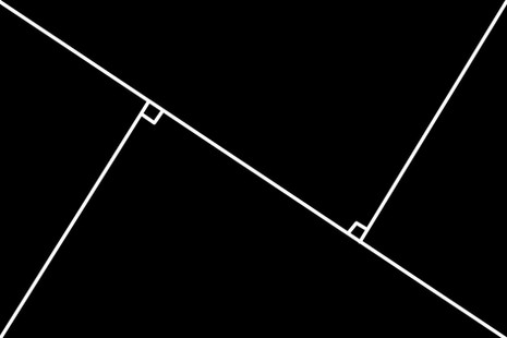


You can use this composition technique in different ways. You can include your image's elements in one of those triangles, or you can have your elements placed across these lines. The points where these lines intersect are visually strong areas, so you can use them by placing the focal point of your image on one of them. Remember that you can also use implied lines along these compositional lines (for example, direction of sight). Finally, keep in mind, that these lines are for you to use as a guide, so they don't need to be perfect there, but only implied.

Rule of Thirds
One of the basic compositional rules in photography and one of the first ones taught in photography schools. This is a composition guide that most beginners are aware of. The rule of thirds is created by utilizing a very important mathematical number that is often found in nature, the Golden Ratio (represented by the Greek letter phi 'φ', as Pythagoras and Euclid were the first mathematicians known to experiment with this number). This number is φ = 1.61803398875 which we see in natural patterns all around us, such as in plants, shells, music, and almost everything. We can see it in the ratios of our arms, fingers, legs, and everywhere else in the human body.
Side mathematical note: In mathematics, two quantities are in the golden ratio if their ratio is the same as the ratio of their sum to the larger of the two quantities. Expressed algebraically, for quantities a and b with a>b>0
( a+b ) / a = a / b =: φ
The simplest application of this in our frame is to draw a parallel line from each side that divides the respective side in the golden ratio. We thus come up with the following composition:

This result is often simplified as the golden ratio is a number close to 1.5. Therefore if we apply this to a standard photographic frame, which is 3:2 we end up with a composition that divides our frame into nine equal parts as below:

You can take into consideration either one of those cases to create your image. As explained, these are only guidelines, so no one is going to take out a ruler to measure if you got it right.
By doing that, you end up with four points where the lines intersect, the four lines, and nine compartments. The important elements for you to consider here are the four lines and the points where they intersect. It has been observed that by placing objects and notions along those lines or at those intersecting points, the eyes of the viewer are drawn to them and they are also pleasing to the eyes. This is probably the simplest way to create an attractive composition.

Curves
Curves pose a very dynamic element in the Visual Arts and good photography always uses them. You can see it in rivers, mountaintops, lakes, trees, flowers, humans, animals, fish, just everywhere. There is nothing that exists in the natural world that is a straight line. In our venture to imitate nature, using curves is a very natural idea, as curves exist everywhere around us. Try to find curves formed from lines, or curves implied by the direction of a look or a path in your composition. The curves can be simple, waves, etc. There is a special curve, pictured below, that is called Arabesque, which is a commonly used curve, throughout the history of the Visual Arts.


Odd numbers
It has been noticed that an odd number of something is more pleasing to the eyes than an even number of the same something. Or did you think that the reason we always buy flowers at an odd number, was just a superstition? You can apply this “Rule of Odds” in your photography by having an odd number of subjects rather than an even one. Having said that, remember that subjects in photography are the number of forms across an image, rather than the number of persons or objects. That means that, for example, when you have an even number of people to photograph, you can still make the total number odd, by arranging two or more people together, thus suggesting one form as a combination. Using this technique can provide you with a successful composition.

Straight lines
Maybe not common in nature, we see many straight lines around us as well. These are more common in the artificial world, for example, buildings, some roads or road lines, antennas, notebooks, pens/pencils, frames, and more. There are also some natural lines that, although they are curves, might look like straight lines to us, such as the horizon, tree trunks, etc.
Every compositional element in a frame provides a certain dynamic to the image. The straight horizontal lines in photography would be the least dynamic lines of all. We use them when we want to communicate serenity, calmness, and quietness. This is true because a horizontal line in our brain signifies a stable structure. Think for example of a cut tree trunk sitting on the floor. This is a straight line. This trunk has no possibility of falling, it is now as stable as possible.

On the other hand, vertical lines have a more unstable quality to them. In the example above with the tree trunk, think of it again, this time standing up. This is a more unstable situation. Something might happen to that tree and make it fall. We use vertical lines to show a less serene situation where something might happen at any moment and disrupt it. They provide our image with a slight sense of uneasiness.
Diagonals
Diagonals are the most dynamic lines in the group of straight lines and help enhance your artistic vision. If we think again about the example of the tree trunk, this time is in the actual process of falling. The diagonal lines are the most unstable lines of the group of straight lines. They give a much greater sense of uneasiness and also action happening. We are now in the process of disruption, rather than waiting for something to happen.

Fibonacci Spiral
The Fibonacci Spiral is a compositional arrangement also based on the Golden Ratio φ. This is also a pattern that occurs on multiple occasions in nature, such as in plants and shells. Any form of Art draws inspiration and ideas from nature.


The way this is applied in photography is by drawing a Fibonacci spiral, starting from one corner of the frame. This is done by dividing the initial frame from one side according to the Golden Ratio and doing the same for each occurring new segment. You then connect each new segment with a curve. This can be drawn from any of the four corners of our frame. You can thus end up with four different versions of the composition:


The endpoint of the spiral now suggests a strong point in the frame, and anything placed along the spiral adds to the dynamic of the image. Again, whatever is placed along the spiral does not have to be a physical object, but it can be a movement direction, etc. This is one of the top 10 photography composition techniques for me.

Frame within a frame
This is one of the basic composition guidelines. It is called a frame within a frame and the initial frame of your photograph is also counted. This is done by introducing new frames within your image to enclose subjects. The new frames can be formed using multiple techniques and items, such as actual frames, doors, windows, reflections, mirrors, and much more. This is a very old technique and has been used successfully on many occasions. Try to find frames within your composition and place your subjects inside them.

Values (Contrast)
Understanding the values and shades within an image is very important in photography and can boost your creativity. Notice in the example below how item A is the strongest in the frame compared to the other three. Our eyes are drawn first to that, followed by B, C, and D. This is by no chance. Our eyes are drawn to the place with the highest contrast and as you may see in this image, item A has the strongest contrast in the frame.

Apart from the fact that we see item A first, you may also notice that we perceive item A as the one closest to us, whereas item D looks like the one furthest away. This is how we also see and one way that our brain understands depth and distance. The items closer to us have more contrast as well as more saturated colours, whereas the items further away from us have less of both. To use this in your photography, make sure that your main subject has the most contrast in the image and that contrast diminishes for lesser subjects.

The Blur Test
This is a small trick to see the highest contrast in your image when you first try to apply this technique. You can blur the image to make it easier to understand the values and contrast. This can be easily done in post-processing, using Adobe Photoshop and Gaussian Blur ( Filters>Blur>Gaussian Blur ). However, you can also practice doing that with your eyes, to be able to see the highest contrast before you take the photograph. To do that, you can close one eye and half-close the other one so you get blurred vision. This way you can easily spot the place with the highest contrast in front of you.

Surrealism
Surrealism is a great quality when it comes to photography. Try to find scenes that look out of the ordinary, objects misplaced, or otherwise surreal. This has been used throughout the history of photography, often with very interesting results. You can also try to make the ordinary look extraordinary. Some common techniques might include overlapping faces with objects, overlapping elements to make the look misplaced, deliberately cutting off the heads of your subjects, finding weird juxtapositions, obscuring faces with silhouettes, using flash to create unnatural scenes, and more. In general, try to create an image that suggests more questions than provide answers.

Scale in Composition
Scale is very significant in photography as it helps the viewer understand the actual size of the portrayed subjects, or, if you prefer surrealism, misinterpret the actual sizes of the subjects. As discussed, photography is a two-dimensional interpretation of the world, so the sizes of forms are not easily understood. To help the viewer realize the size of the surroundings, it is a good idea to use a person or an object, the size of which we know, as a reference to compare to its environment.

Multiple Layers
Using multiple layers in a composition creates interest in your frame by creating more complexity, as well as adding to its depth. Try to include subjects in three or more layers within your frame, including foreground, middle-ground, and background. This way it is easier to create interest throughout the whole frame as well as show the actual depth of the scene. You can experiment by using smaller aperture values to have as much focus as possible. Make sure that you find the right background to enable you to shoot in layers. Always try to avoid figures overlapping to enhance the experience of depth, and work the scene, by shooting many images with micro-corrections to successfully capture what you have in your mind.

Perspective in Photography
The way perspective is perceived in your image plays a significant role in the result. Photographic lenses are very important to that end, as each lens 'sees' the world from a different perspective. I always suggest using one lens for a long period, if not forever. This way you have a clear understanding of how your camera sees the world and you can focus on working on each scene to come up with the perspective that works best with your photograph. The two aspects that you have to control to come up with the right perspective, are the distance and the angle which you are shooting your subject from. These two factors are not only very important, but a deviation of even one millimetre might change your photograph entirely. Always make sure that you have made enough images of the scene doing micro-adjustments every time to get it right.

Horizon (eye level)
It is common for people to confuse nature's horizon with the horizon in a photograph or any other work of the Visual Arts. We understand the horizon in nature to be the line that separates the sea or mountains from the sky. This is true, but on many occasions, this horizon is obscured by objects, buildings, etc, so we are not able to see it. In visual arts, we usually call this eye level instead. Nature's horizon coincides with our eye level. It is not a fixed line that exists somewhere and we can look at it from a low or a high angle. Horizon only exists at the level at which we are looking. Therefore the line of the horizon is there in every image we make, at the level of our eyes. We can thus shoot from different heights, such as utilising low-angle photography, and also change the height at which this horizon line lives. I always strongly suggest to any aspiring photographer to take some drawing lessons to be able to better understand these kinds of notions. Changing the level of the horizon also changes the perspective of our image. This is done because it defines the proportions of all our objects placed in the frame. Changing the horizon level changes the proportions and makes the objects look smaller or larger. This is because, for each object, if we draw its angular lines, meaning that if we follow the lines of the object for each of its dimensions, they will meet at the same point in the horizon line. This is known as the vanishing point. So, when we change the height of the vanishing point, the lines of the object also change to meet at the new point.


The article is continued in part 2. Read here.
Get your copy of the book by George Tatakis, “Throw away your camera & become a photographer” on Amazon

⭐⭐⭐⭐⭐ 5-star review from Readers' Favorite


Comments